Engagement Portal
The Engagement Portal is the bank's centralized hub for managing all customer communications across digital and non-digital channels.

The Context
Maybank is Malaysia's leading bank, operating at a massive scale. 45,000 employees serving over 10 million customers across eight countries in Southeast Asia.
The challenge: How do we enable employees—relationship managers in branches, customer service teams, and marketing staff to manage customer engagement in a unified way?
At the time, these teams were juggling eight different systems to reach customers. Email through one platform, SMS through another, mobile app notifications through a third, branch communications through something else entirely. It was chaos.
A unified engagement platform that enables bank employees to create, orchestrate, and optimize customer communications across all channels from a single interface with built-in personalization, approval workflows, A/B testing, and real-time analytics.
What is the Engagement Portal?
The Engagement Portal is the bank's centralized hub for customer communications. It enables bank employees to orchestrate personalized interactions across all digital and non-digital channels, such as email, SMS, mobile app, branch signage, and ATM screens from a single platform.
The goal: streamline all customer engagement to make communications more personal, more consistent, and ultimately more meaningful and humanized.
My Role & Approach
As Lead UI/UX Designer, I:
Led end-to-end design from research through launch
Conducted 30+ stakeholder interviews across Marketing, IT, Compliance, and Leadership
Shadowed employees to understand existing workflows and pain points
Designed and validated prototypes through iterative usability testing
Built a comprehensive design system with 120+ components
Collaborated closely with engineering on technical feasibility
Defined approval workflows to balance speed with compliance
Design Approach:
Research → Define → Ideate → Prototype → Test → Iterate → Launch → Measure
Why it Mattered?
We set out to solve three fundamental problems:
Effortless Journey Design
The Problem:
Bank employees needed a way to manage communications across multiple channels — including email, SMS, mobile apps, branch signage, and ATM screens — from a single platform.
Previously, launching a multi-channel campaign required navigating up to eight different systems: logging into the email tool, switching to the SMS platform, and manually coordinating with branch teams for signage updates. The process was fragmented, time-consuming, and inefficient.
Our goal was to simplify this experience by making multi-channel orchestration seamless and intuitive — one platform, one workflow, all channels in one place.
Quick & Easy Setup
The Problem:
Marketing teams and relationship managers aren’t technical specialists, so they shouldn’t have to rely on IT support to launch routine customer communications.
Our focus was to streamline the process and reduce the effort required. If a campaign that previously took five days to prepare could be completed in just 30 minutes, the gains in efficiency would be significant.
Speed wasn’t simply a nice-to-have — it was essential for business agility. Markets evolve quickly, customer expectations shift, and employees need tools that can keep up with that pace.
Real-Time Optimization
The Problem:
Previously, employees would launch a campaign and then wait weeks to understand whether it was effective — and by the time insights became available, opportunities to adjust had already passed.
We wanted to change that by enabling real-time visibility into performance and supporting rapid experimentation to improve outcomes.
This meant introducing built-in A/B testing, live analytics, and immediate feedback loops. Employees could quickly identify what was working, learn from the data, and optimize campaigns in real time — not weeks later.
The Problems Employees Faced
What were bank employees actually struggling with daily?
No Visibility
If a customer called to ask, “Did you send me something about my credit card?”, service representatives often had no visibility into the customer’s full communication history. As a result, they were unable to confidently answer even basic questions about the bank’s own outreach.
Inconsistent Messaging
Marketing might send a message via email, while the branch team remained unaware and communicated something entirely different. The result was a fragmented customer experience — not due to a lack of effort from employees, but because the tools did not support alignment and consistency across teams.
Painfully Slow
Launching even a simple campaign required days of manual coordination across multiple teams.
No Personalization at Scale
Everyone got the same generic messages because creating personalized communications for different customer segments was manually impossible. The tools weren't smart.
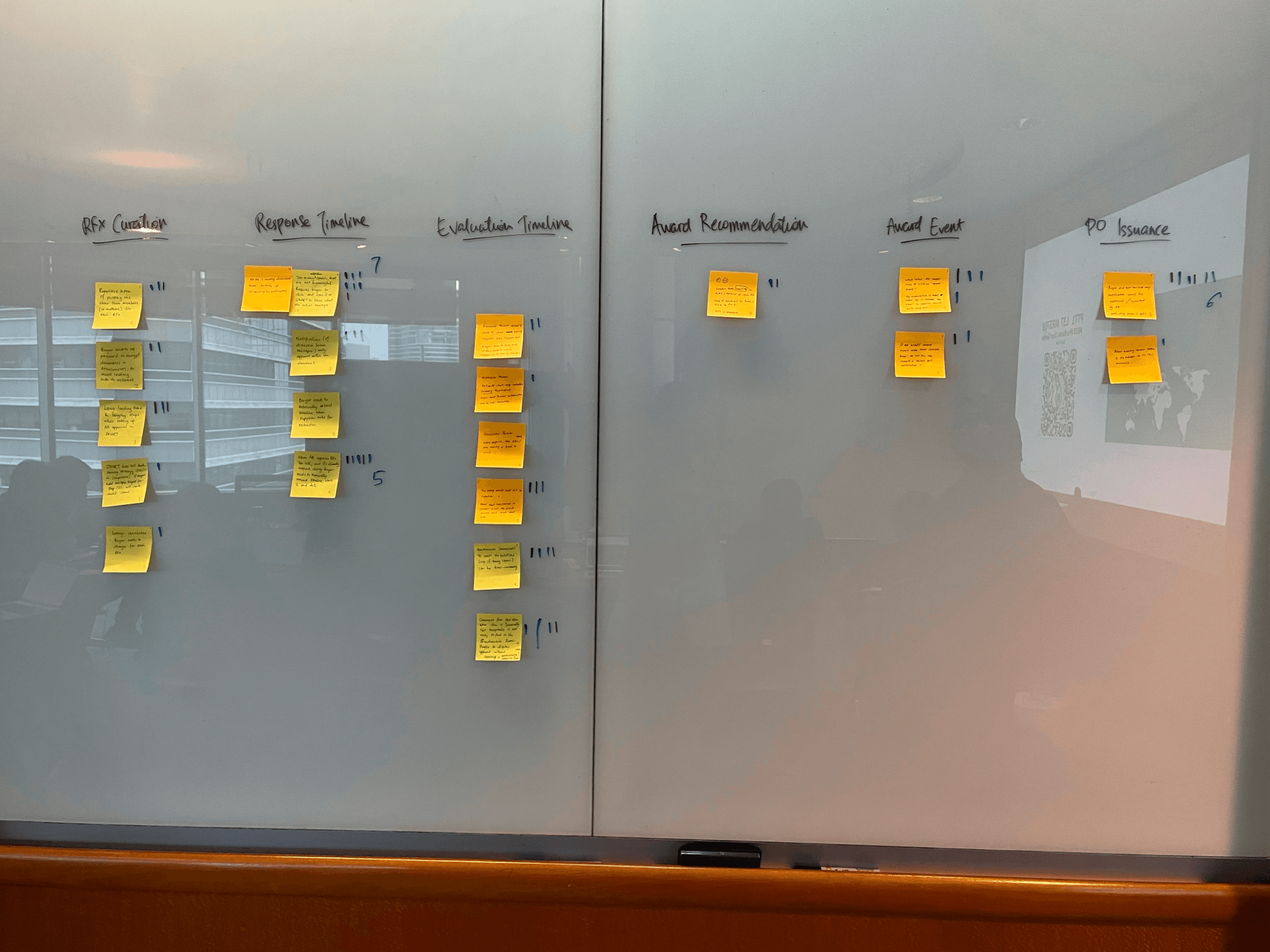
Research & Discovery
Before we designed anything, we invested heavily in research. And I mean really invested, we spent six weeks just understanding the problem space.
Research Method:
Stakeholder Interviews
We engaged with a wide range of stakeholders, including marketing leaders, CRM managers, branch relationship managers, IT teams, and compliance officers — because in banking, it’s impossible to design effective solutions without a clear understanding of regulatory constraints. In total, we conducted interviews with more than 30 stakeholders across the organization.
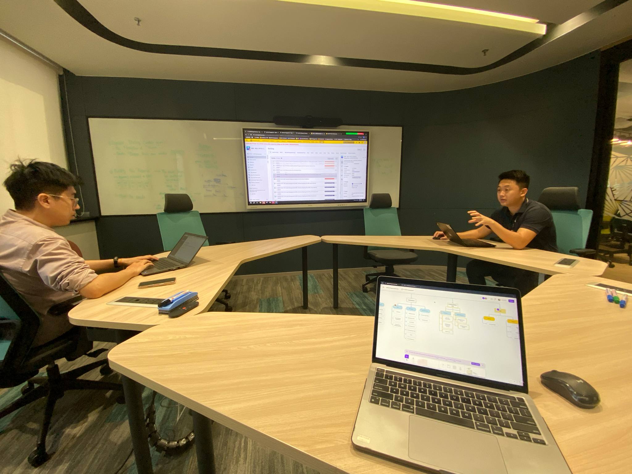
Employee Shadowing
This step was essential. We spent entire days shadowing relationship managers in their real work environments — observing how they navigated between systems, listening to their frustrations, and identifying where they encountered friction. We also followed customer service representatives in call centers and marketing teams as they launched campaigns. Direct observation revealed far deeper insights than simply asking people to describe their processes.
Analytics Audit
We conducted a deep analysis of existing channel performance to understand how customers were truly engaging with communications. We examined which channels drove the most interaction, where drop-offs occurred, and what the data revealed about what was effective versus what was not.
Competitive Analysis
We examined leading orchestration platforms like Salesforce Marketing Cloud, Braze, and Adobe Experience Platform to understand best-in-class practices. Our goal was to identify patterns we could adopt or enhance to create a more effective, streamlined solution.
Key Findings
"Staff spend 60% of their time on administrative tasks instead of actually talking to customers."
Consider this: relationship managers are meant to focus on building customer relationships, yet they spend much of their time navigating complex systems and performing manual data entry.
"No single source of truth."
Ask three different people, “What did we send this customer last week?” and you’d likely get three different answers. The information was scattered, making it impossible to get a clear, unified view.
"Mobile access was critical but completely neglected."
Relationship managers operate in branches, in the field, and at client sites — they’re rarely at a desk. Yet every existing tool was designed for desktop use only.
Great product design begins with a deep understanding. We could have created a visually appealing interface that missed the mark. Instead, by taking the time to fully grasp the pain points, we built the right solution.
The Solution
So here's what we built: a unified platform that puts all the power in employees' hands.
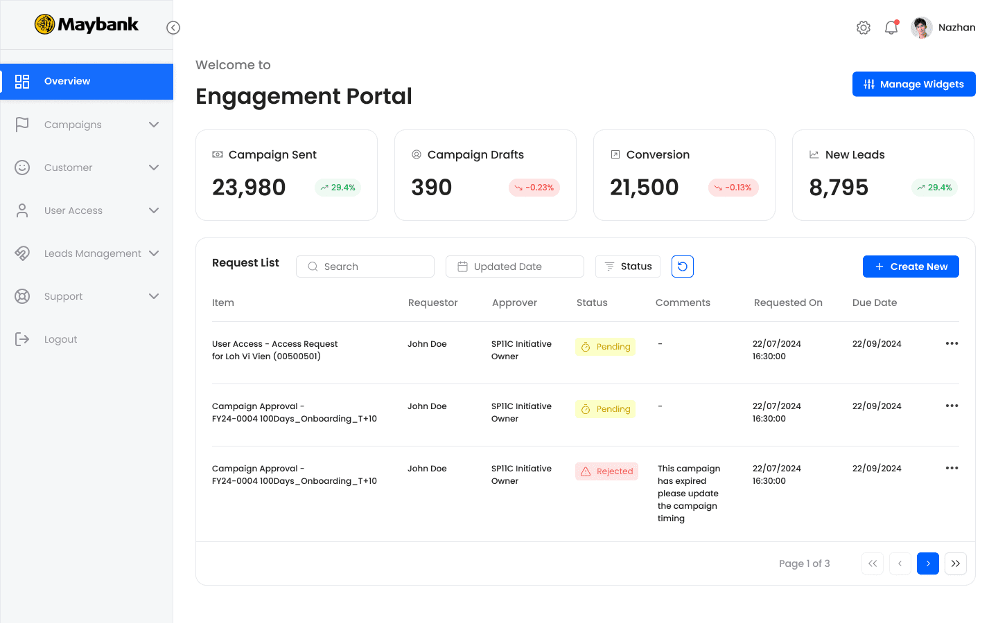
Instead of juggling eight systems, employees now have one interface where they can create, orchestrate, and measure customer communications across every channel.
Key Capabilities:
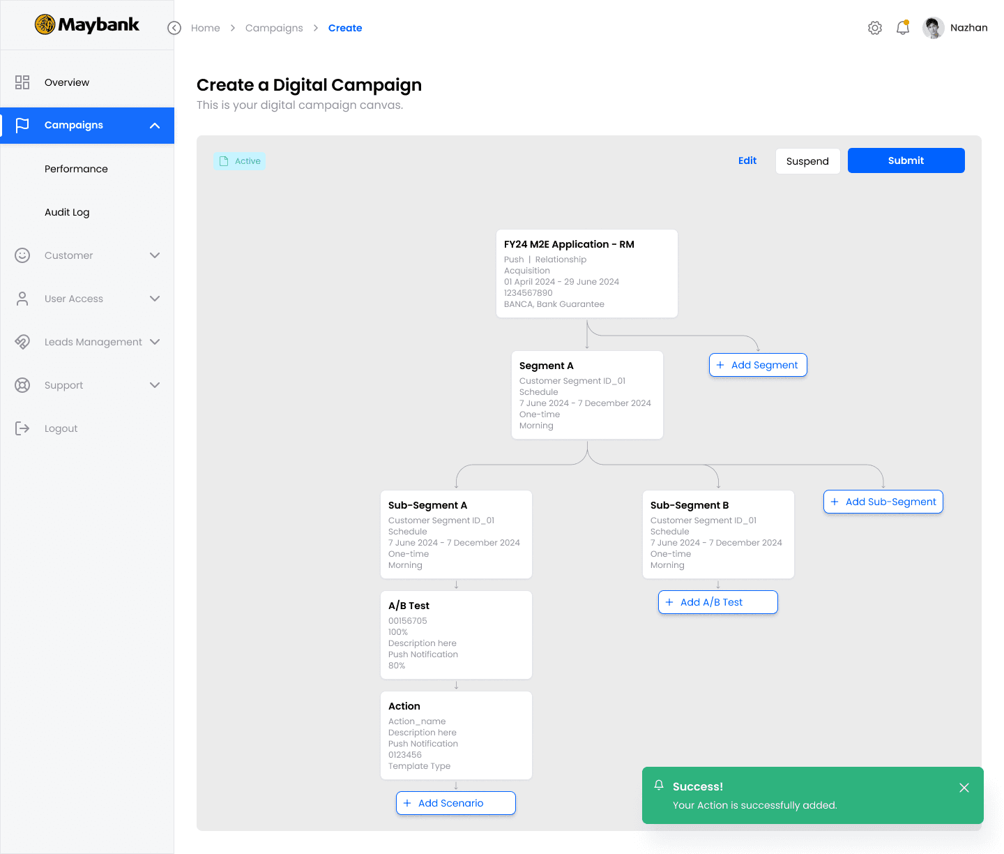
Multi-Channel Orchestration
Employees can choose from seven channels — email, SMS, mobile app push, in-app messages, branch digital signage, ATM screens, and website banners — all within a single creation workflow with automatic distribution.
Smart Personalization
Dynamic customer segmentation is made simple with drag-and-drop filters — no technical skills needed.
Content Library
Pre-approved templates maintain brand consistency and regulatory compliance, while allowing employees to customize safely within defined guidelines.
Real-Time Analytics
Not just “here’s your data,” but actionable insights: “here’s what it means and how you can act on it.”
Compliance Built-In
Approval workflows, audit trails, and regulatory language checks are built in. In banking, compliance is non-negotiable, so we designed for it from day one.
Design System
Building the Foundation
When you're building an enterprise platform with over 80 screens serving thousands of employees, you can't just design page by page. You need infrastructure.
So we built a comprehensive design system.
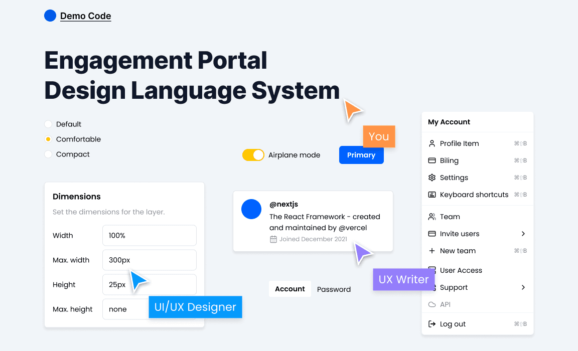
We developed over 120 reusable components — including buttons, form inputs, data tables, cards, modals, navigation patterns, and status indicators. Each component documents every state: default, hover, active, disabled, error, loading, and success.
This ensures consistency across the Dashboard, Campaign Builder, and Analytics view, helping users build muscle memory as they interact with the platform.
We also implemented a semantic color system using design tokens — not just “blue” or “red,” but precise values like Primary-500, Success-600, and Warning-400. Designers and developers now speak the same language, eliminating vague instructions like “make it that shade of blue-ish.”
Why We Invested in the Design System
First, consistency. When a button looks and behaves the same across 80 screens, users don’t have to relearn patterns, reducing cognitive load.
Second, scalability. The platform was designed to grow — with new features, channels, and user types. The design system allows us to add modules like Lego blocks, rather than custom-crafting each piece from scratch.
Third, speed. Developer handoff is seamless. Instead of describing a button as “medium-sized with rounded corners and a shadow,” I simply say, Button-Primary-Medium. Developers know exactly what to build, cutting design-to-development time in half.
Fourth, accessibility. WCAG 2.1 AA compliance is embedded in every component — including color contrast, keyboard navigation, focus states, and ARIA labels. Every new screen is accessible by default; we’re building inclusively from day one, not retrofitting later.
Fifth, multi-language support. Maybank operates across eight countries. The system handles English, Malay, and Chinese, accounting for different character sets, text expansion, and right-to-left layouts where required.
Working with Developers
I worked closely with a team of 5 engineers to develop the designs for the Engagement Portal. I scoped out tickets for the front-end engineers with user stories and product requirements. I also encouraged the team to look into using a third-party component library to quicken the implementation process and spend less time worrying about the component interactions.
As part of the future vision, I created an Information Architecture of the platform to help engineers understand how the overall site architecture worked.
Results and Takeaways
Working on this project was an extremely steep learning curve. It was an eye-opening experience that taught me a lot about being lean and knowing when and where to focus your energy and efforts.
Some key takeaways from this project are:
Focus on building an MVP: There is only so much time and effort that you can invest so it's important to focus on the features that can deliver the highest value for your users.
Don't worry too much about the details: Earlier in my journey, I made the mistake of worrying about the look of the UI. Taking a step back and reassessing the user flows helped me to reprioritize the UX.
Focus on the problem: At the end of the day, it is your user's pains that you will be solving for, so keeping that front of mind is important as it's easy to lose sight of this when you're bogged down in the day-to-day.
Menu